Open for Inspection with Inside Out
Sometimes I find an incredible home in the pages of an interiors magazine and I find myself wanting more. I want to run my hands along the concrete benchtop, have a good poke around in the garden, and marvel at other’s people’s Really Good Ideas.
I recently got to do just that when the editor of Inside Out magazine, Claire Bradley, along with the lovely folk from Bugaboo, invited me along to their Open for Inspection tour at the Geelong home of Lauren and Matt Wilson. Lucky me! As a long-time subscriber of Inside Out magazine, I was excited to meet the super-talented team and spend the morning in what was really an incredibly inspirational family home.
Photography by Nikole Ramsay, courtesy of Inside Out.
(As an aside, I’m terribly proud of the fact that Australian interiors mags have established themselves as some of the best in the world, with international design bloggers amongst some of their biggest fans. Go Aussie homes mags! Go Aussie editorial talent! I know how hard these guys work and they really do deserve kudos for kicking some serious publishing goals in a pretty tough climate. Who said that print is dead?)
Matt and Lauren’s home is a perfect lesson in functional Australian family living at its best. It’s their eighth renovation – Matt runs Built By Wilson, a company that specialises in architectural homes – and they reckon they’ve finally got it right for their family, including sons Teddy, 4; Henry, 3; and Jimmy, 8 months; and Elvis the kelpie.
The home is a renovated ‘30s Californian bungalow in the Geelong suburb of Newtown, and carefully considered open-plan space embraces liveable design – and it looks darn good. Have a closer look at some of my favourite spaces.
Kitchen
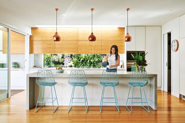
Lauren in her beautifully appointed – and spacious – kitchen. Photography by Nikole Ramsay, courtesy of Inside Out.
One of my favourite rooms in the house, the open-plan kitchen combines beautiful materials, splendid finishes, and loads of storage with an excellent view of the living room, play room, outdoor deck and backyard. Claire pointed out that the proportions of the kitchen are just a little bigger than what you would expect, which is a luxury itself.
Inside Out’s market editor Joseph Gardner was also on hand to talk us through the details, including the stunning Lightly ‘Godfrey’ copper pendant lamps, American oak cabinetry, benchtops in Carrara marble and Boss Architectural ‘Ciment’ concrete, which brings a tactile element to the space.
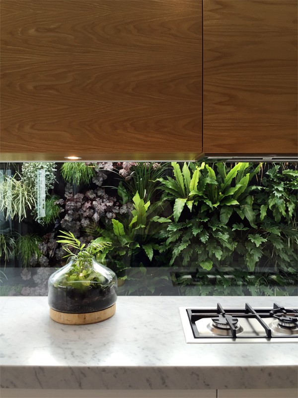
I loved the glass splash back that looks out on to the lush green wall that Matt and Lauren created with Jamie Durie’s Vertical Gardenwall blankets.
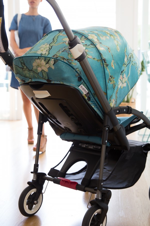
Baby’s got style: Bugaboo Bee 3 + Van Gogh collection stroller. Photography by Nikole Ramsay, courtesy of Inside Out.
Dining room
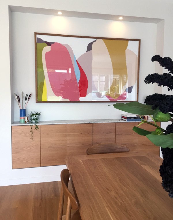
The proportions of the elongated dining table, designed and made by Matt, combined with the Ubabub Sundae framed print, sets a colour-filled scene for expansive family living in the dining area. The curved-back ‘170’ timber chair by Takahashi Asako from Feelgood Designs are a great choice of dining chair, and it’s in this space that Lauren and Matt’s Australian spin on the Scandi theme really shines.
Claire noted that Scandinavian style works so well in Australia because it suits are environment so well – despite completely different climates. Our light-filled homes work in harmony with Scandinavian design and furniture, and this house captures that relationship perfectly.
Living room
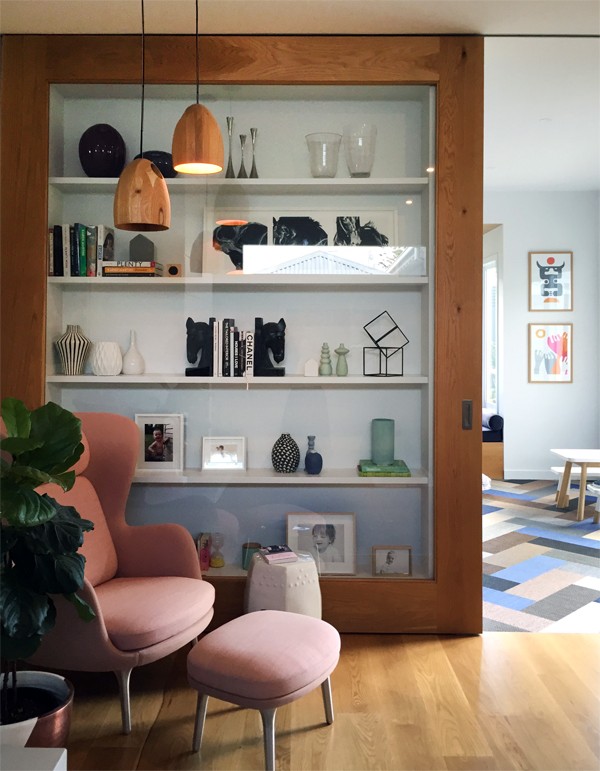
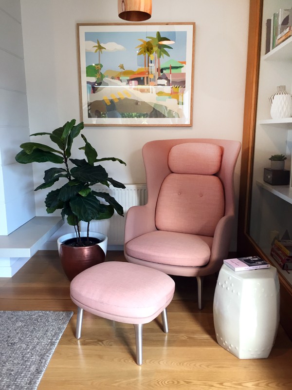
There are three hero pieces in this room: the pale pink curved-back ‘RO’ feature reading chair by Jamie Hayon; the beautiful choice of art print by Michael Muir; and the custom-made floor-to-ceiling timber cabinet, which Matt designed himself. It features a glass door which slides across to close off adjoining play room, providing a clever and practical way to display treasured objects while protecting them from curious kids.
This was a talking point for Joseph, who said that “a lot of people would have shelving and then feel the need to fill it, and it would become incredibly distracting and visually heavy. But Lauren’s created this really gorgeous selection of smaller vignettes.”
Play room
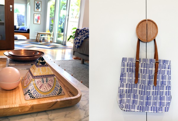
You can see the play area just beyond the glass cabinet, which also opens up into the back yard. The clever use of Bolon carpet tiles from The Andrews Group are the hero feature of this room, which create a gorgeous geometric pattern while ticking the practicality-with-kids box. They’re made from vinyl so messes can be easily and quickly mopped up. Combined with the ‘Babanees’ table setting from Green Cathedral and Elroyink prints, the play room is a bright and cheerful space that both adults and kids can enjoy together.
Kids’ room
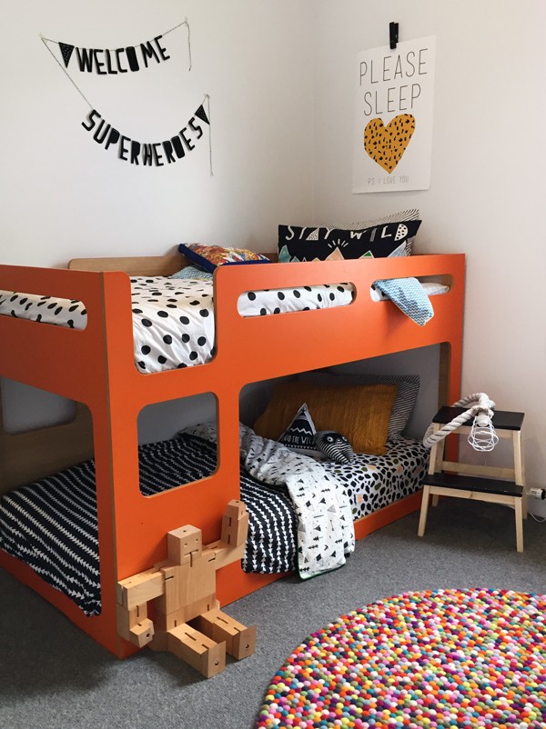
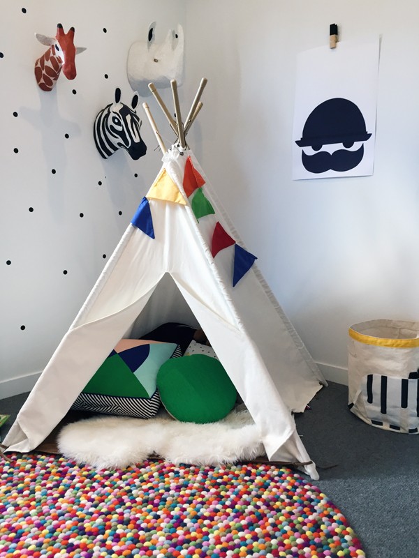
I love any space that features a brave use of colour, and you can’t get any braver than the boys’ orange bunk bed from Domayne. It’s a great choice for two boys, with the bottom bunk at floor level so the two-year-old can just roll out of bed in the morning. Colour and pattern is also introduced into the room with the Cotton On bedding, which has great price points and can be changed around easily.
Master bedroom
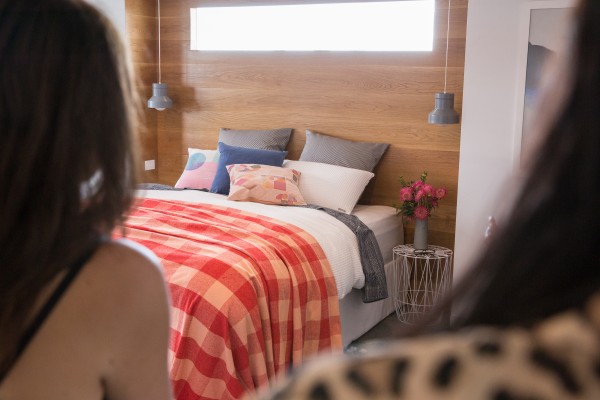
Master bedroom. Photography by Nikole Ramsay, courtesy of Inside Out.
One thing that really stood out for me in Matt and Lauren’s home is how they’ve been really clever with their use of colour and texture, and you can see how this comes together in their master bedroom.
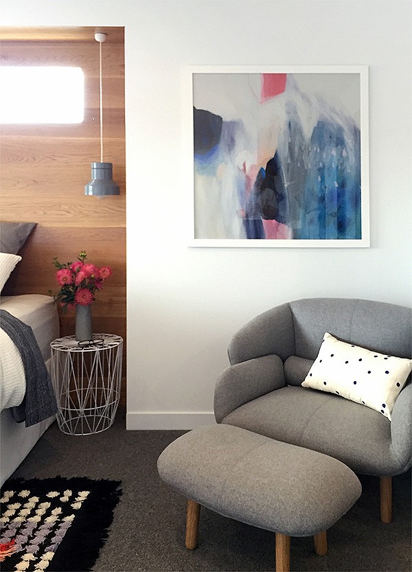
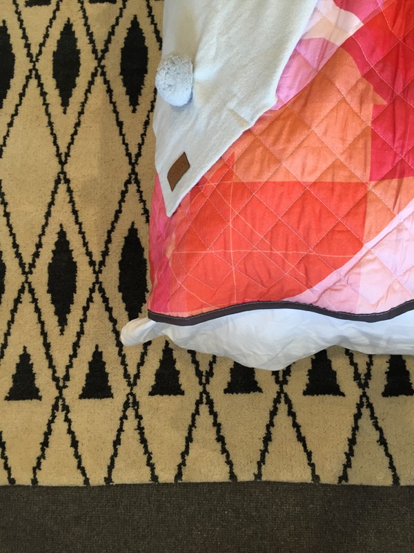
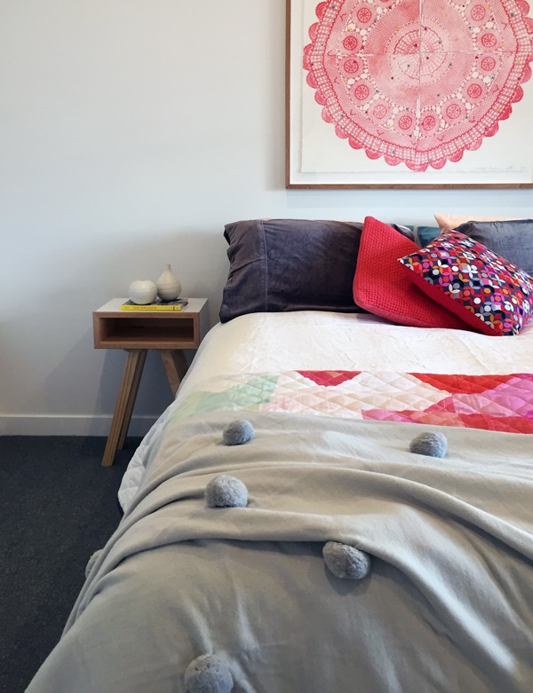
A Kip & Co cushion and blanket, combined with the gorgeous Lola Donoghue artwork, are unexpected choices of colours that somehow work wonderfully together. Soft greys are introduced with the lamps from David Moreland Lighting and the BoConcept chair.
Spare bedroom
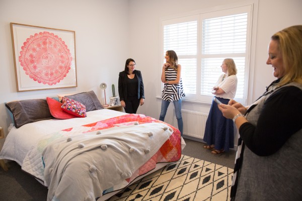
Inside Out editor Claire Bradley, Rebecca Judd, and me – checking out the spare room. Photography by Nikole Ramsay, courtesy of Inside Out.
According to Claire, this is the “The best-looking spare room.” Clever use of colour is again achieved in this room, with echoes of the reds and pinks from the upstairs master bedroom.
I really love the attention to small details in this room, like the door handles from Interia, which are made from one hundred per cent recycled timber. It takes the room beyond the ordinary and expected, which is a nice point of difference for your typical spare room.
Bathroom
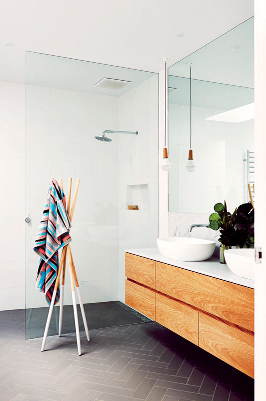
Clean lines and beautiful details in the Matt and Lauren’s bathroom. Photography by Nikole Ramsay, courtesy of Inside Out.
This just might be my dream family bathroom. Featuring timber cabinetry and a free-standing bath, this light and bright space is all about clean lines and a minimalist setting, but it’s the details that really bring it to life, including the herringbone arrangement of the floor tiles from Academy Tiles and the Stephanie Ng Design ‘Scoop’ pendant light.
Lauren’s tip for the best bath for kids? Don’t go for one that’s too rounded – you need a good flat space in the middle for extra stability.
And that’s the end of my tour of Matt and Lauren’s inspirational house. Get the full story – and more amazing pics and details – in the May issue of Inside Out, on sale now. Thanks to Inside Out and Bugaboo for inviting me along to Open for Inspection.
If you love the look of Lauren and Matt’s home, check back here tomorrow for my shopping guide on how to get their style.
Photography by Nikole Ramsay and courtesy of Inside Out, as indicated. All other photography by Rebecca Lowrey Boyd for We Are Scout


