How to style a vignette to Scandinavian perfection
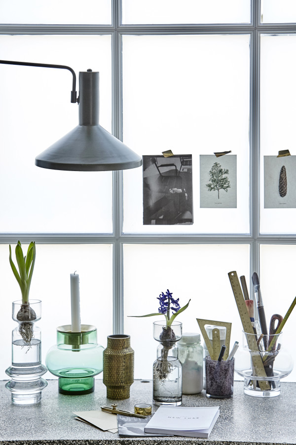
If you find yourself stuck for inspiration when you’re arranging decor in your home, take note of Danish design brand House Doctor. With an extensive range of beautiful and practical homewares, House Doctor is a superb example of combining simplicity with functionality – a signature of Scandinavian design.
It naturally follows that House Doctor’s pieces are styled to perfection for their website, consistent with the brand’s design aesthetic.
Here you’ll find bucket-loads of ideas for styling decor and homewares in every room of your house: a masterclass in how to style a vignette inspired by Scandinavian style.
The Shelf(ie)
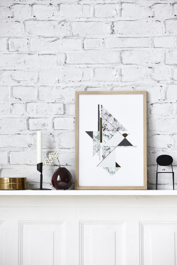
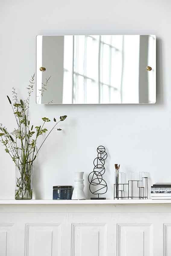
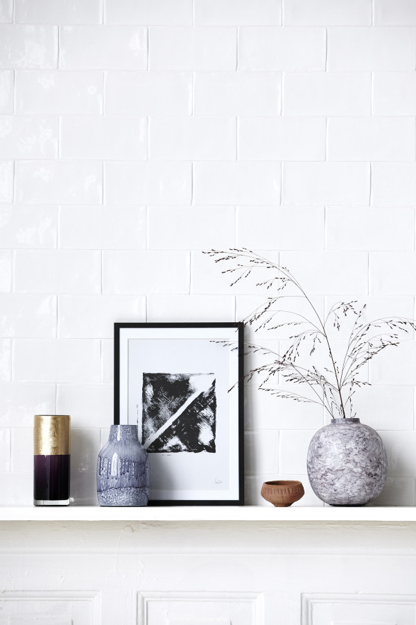
Look at how the various pieces displayed on the shelf are often linked by the sporadic use of a unifying colour, texture or material (ie: black; wire; and glass). It’s not overdone so the trick is not to make it look too contrived. Easier said than done, I know. But have a play and see how you go.
Also note how you can draw an (invisible) triangle in each arrangement, which is the classic guide to creating a balanced vignette. The triangle needn’t be centred, in fact an assymetrical design looks best, but see if you can create lines from the highest piece in your group to the lowest piece.
The Workspace
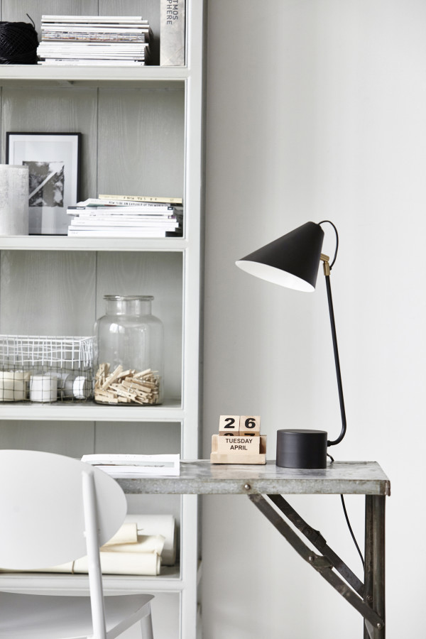
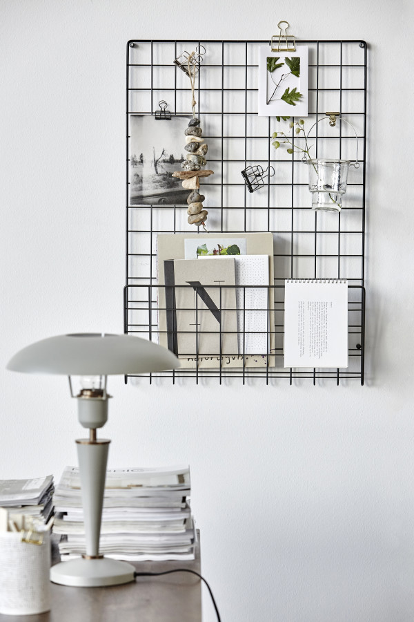
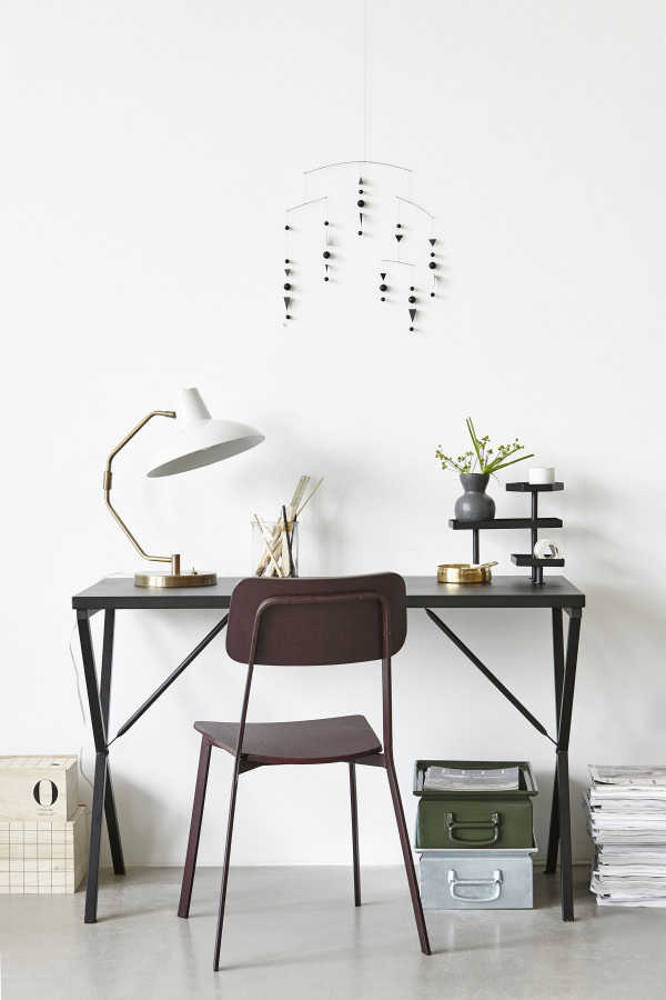
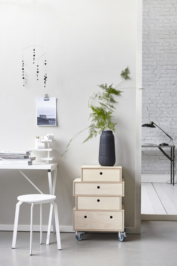
A typical Scandinavian-style palette uses white in various textures, combined with timber or natural materials for warmth. It’s usually accented by black (the mobile against the wall as an artwork is a genius idea and I love the modernist simplicity). Note the mix of materials (timber, paper, metal and ceramics) in neutral hues and a sprig of foliage for a fresh pop of colour.
The Coffee Table
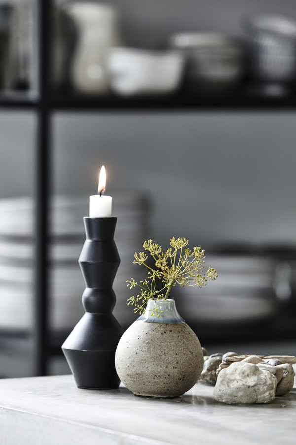
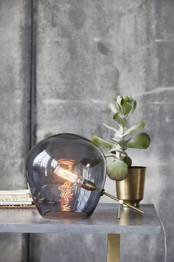
Notice the common feature in the coffee tables above? It’s all about lighting, albeit in different forms. Using candles and table lamps adds creates that all-important sense of hygge (the Scandanavian concept of cosiness and homely warmth). Its’s not a cluttered look, featuring just three completely different objects, which are subtly unified by material (ie. brass) or hue (natural, earthy colours).
The Hallway
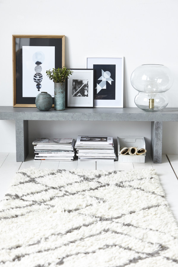
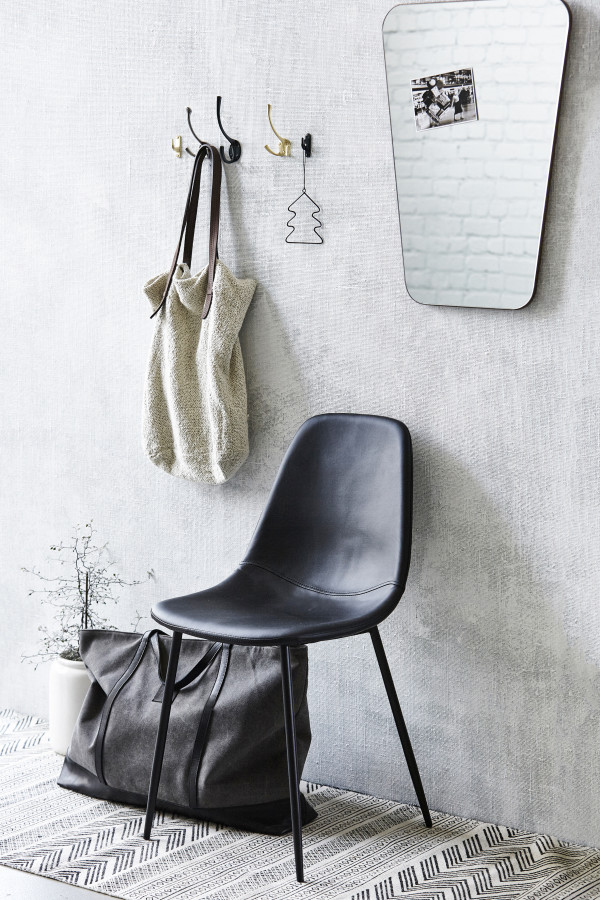
A good hallway setting combines function with style, which is key to Scandinavian design. The hallways above demonstrate two ways to not only organise and store your stuff, but create a pleasing display of objects. Whether you go for a bench or a chair, you can create a sense of harmony by using natural hues with pops of black to tie it all together.
The Sideboard
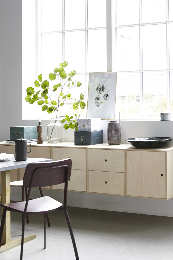
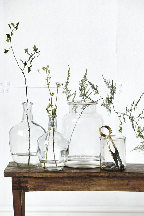
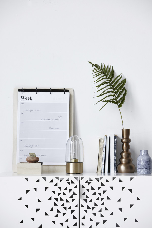
Here you’ll find that foliage and indoor plants feature on all three sideboards, punctuating the vignettes with a pop of green. Note the repetition of materials in glass and brass.
The Kitchen
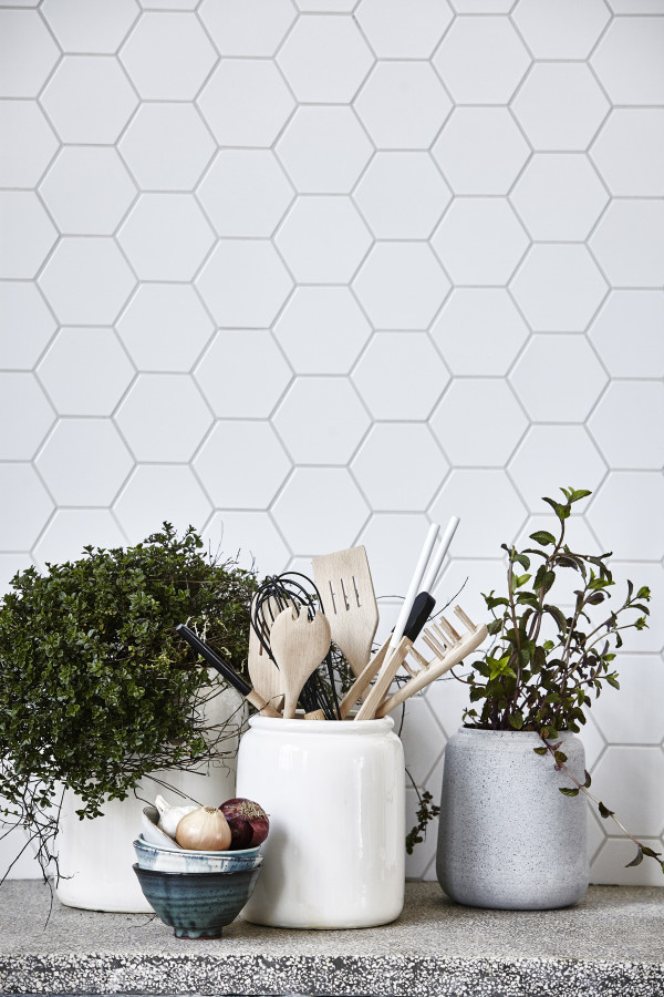
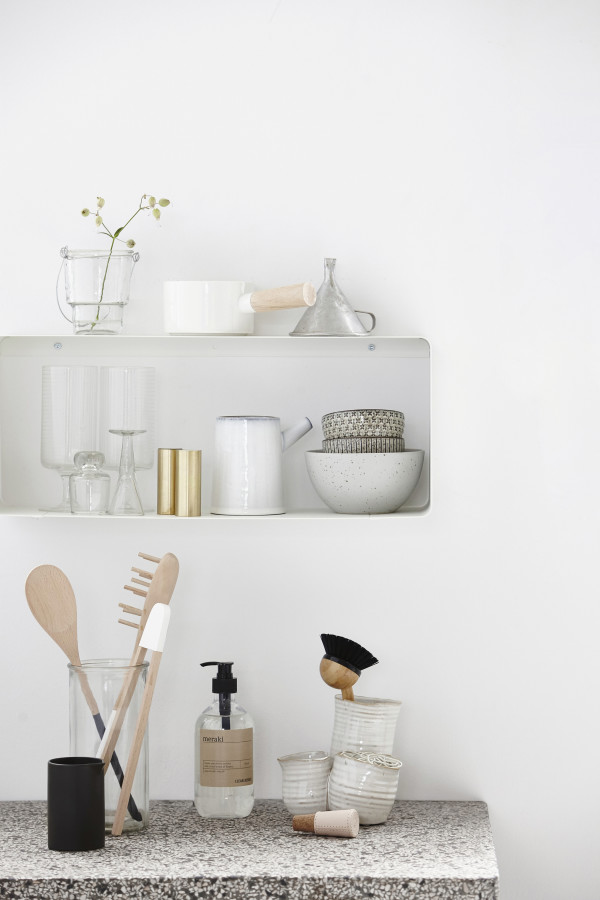
Use your kitchen shelves to display a collection of objects, such as ceramics, glassware and wooden utensils. Both kitchens are set against white uncomplicated backgrounds, accented by granite benchtops.
Collections
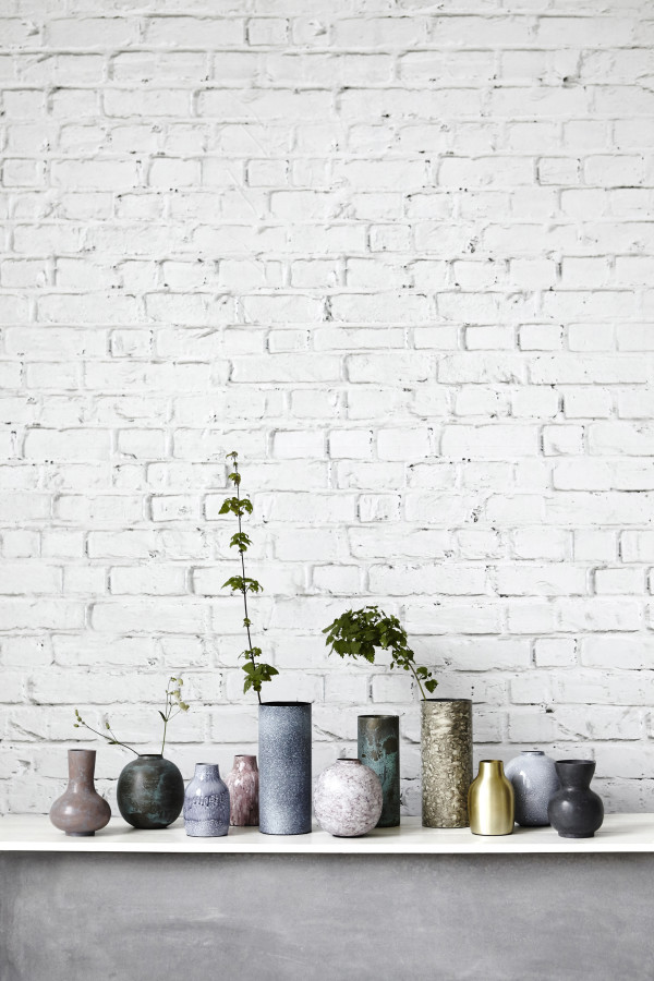
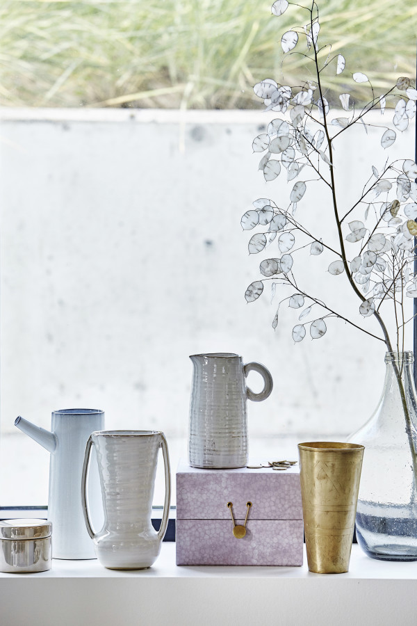
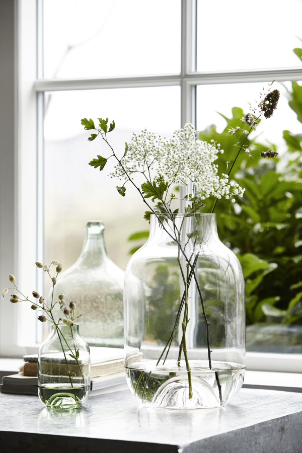
Got a collection of glass or vases you want to display? Keep similar materials together and style them in groups that follow the classic triangle arrangement. Avoid lining things up in a row like soldiers and aim for a relaxed look.
House plants
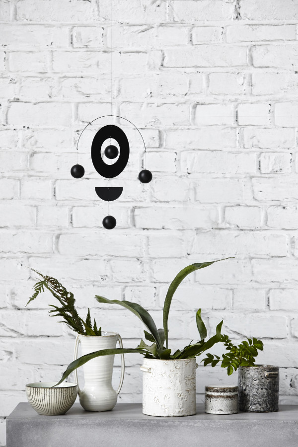
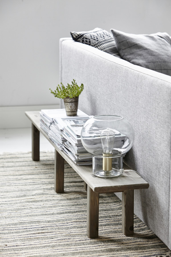
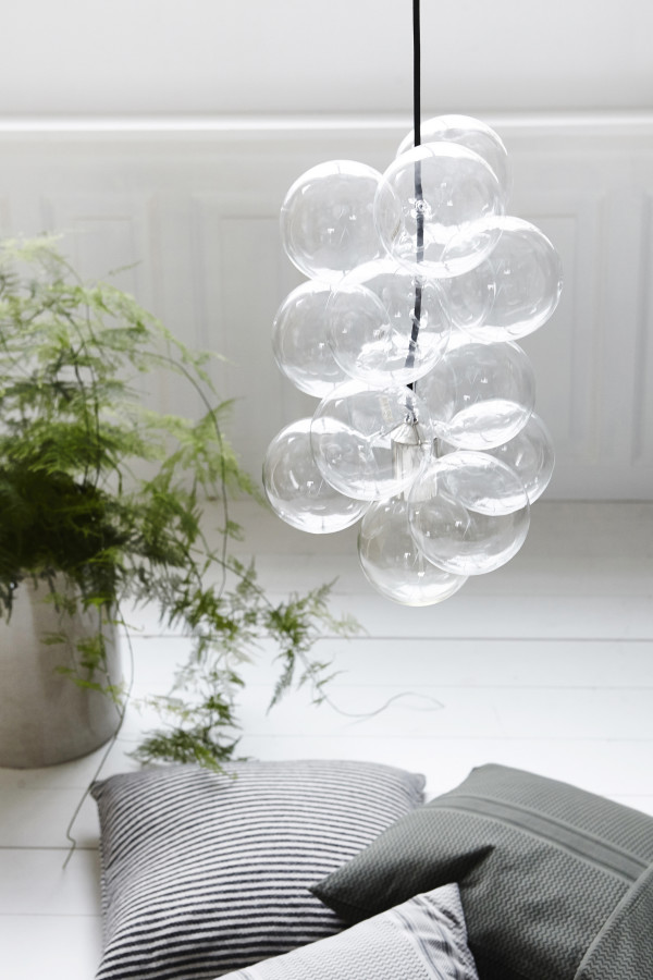
Use house plants and foliage to bring attention to special pieces in your home. You can create an interesting display on a shelf or sideboard by grouping plants and foliage in pots. Choose planters in the same tone but vary the textures.
Gallery wall – and cushions!
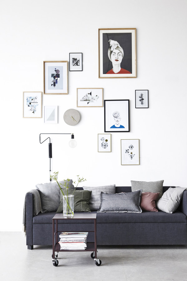
This is a great example of how to arrange artworks and objects on a gallery-style wall. Note how each piece is hung along a roughly diagonal line, with a subtle mix of black, wooden and brass frames. The grouping of cushions, meanwhile, demonstrates how different shapes, sizes and textures work to create interest on the sofa. The whole look is pulled together by using grey as the dominant colour, accented by complementary shades in olive and dusky pink.
Dining table
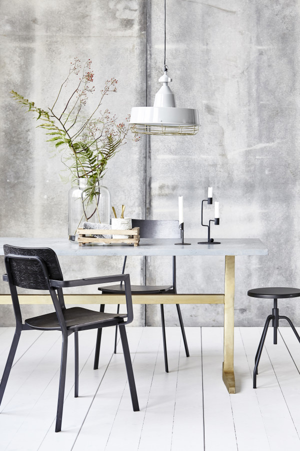
Here you can see how the classic triangle arrangement works to create a sense of drama on the dining table. The pendant serves as the tip of the triangle, while the grouping of (roughly) three different items are positioned off-centre, avoiding that cliched look of one central vase, which is often seen showroom styling.
For more information and to shop House Doctor, click here.
All photography courtesy of House Doctor.
Love Scandinavian style? Me too. Get more Scandi buys and inspiration here.


