My Dining Room Makeover
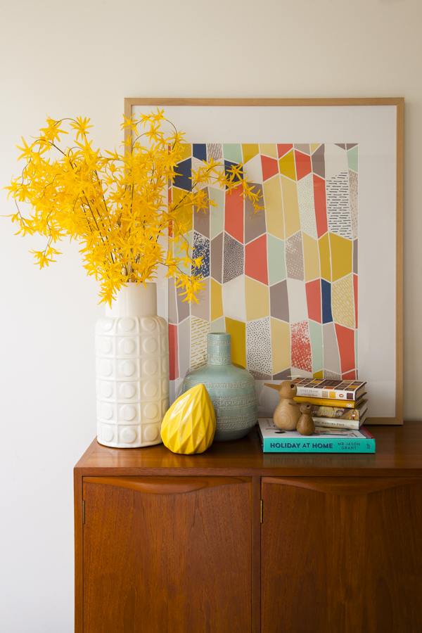
Clementine print, white Charade vessel, yellow spider orchid, Allegra vessel, Winston gem statue, all from Freedom Australia. My vintage Fler sideboard, Vedel birds and books, including Jason Grant’s new book, Holiday at Home. Photography by Lucas Boyd for Wee Birdy. Styling by Diane Birol and Juliana Verissimo/Freedom ID Service. Production by Rebecca Lowrey Boyd/Wee Birdy.
This is a sponsored post for Freedom. Please see full disclosure at bottom of post.
It’s been a long time coming (10 months, to be precise), but after the first round of renovations and decorating, here’s the first look at our home (aka The Treehouse). The Treehouse is a distinctive pole house built in the late ‘70s. Wowed by the sense of space, architecture, light, and the surrounding rainforest, we up and left our two bedroom inner-city digs and headed for Sydney’s bushburbia.
The dining room has probably been the most neglected room in our home, which is a bit wrong as it’s the central hub for family meals and get-togethers. It also leads out on to a deck, which is a busy thoroughfare during the warmer months, so it was time to give it some attention. Here’s what it looked like before the makeover, and after.
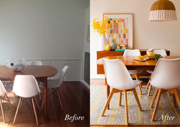
Before the makeover, and after. ‘Before’ photo by me. ‘After’ photo by Lucas Boyd for Wee Birdy. Styling by Diane Birol & Juliana Verissimo/Freedom ID Service, Production by Rebecca Lowrey Boyd/Wee Birdy.
Woah. Can you believe that ‘after’ photo was taken from the same spot? Here’s a closer look at the makeover…
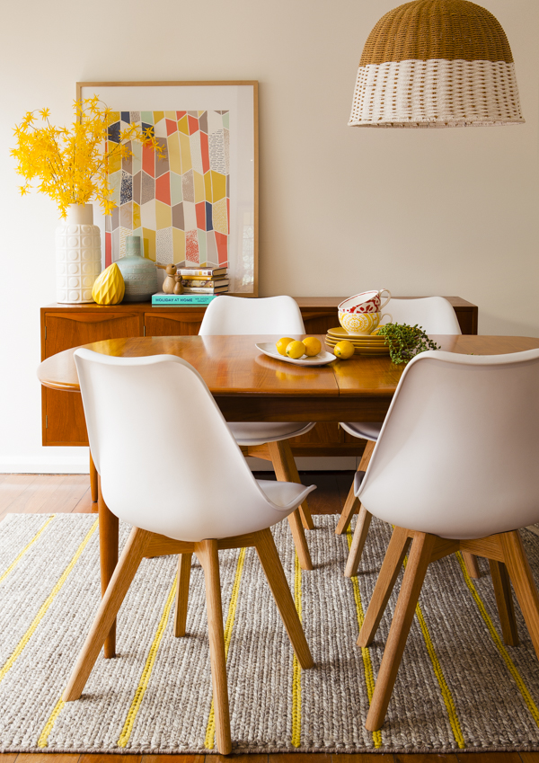
On sideboard: Clementine print, white Charade vessel, Allegra vessel, Winston gem statue in Honeydew. On dining table: Sorrento platter in Nougat, Jett dinner plates in Canary, Impressions mini bowls in Indie and string of pearls foliage, with white Brandon dining chairs, Boyd rug, white Creel pendant lamp, all from Freedom. Vintage Parker dining table and Fler sideboard, my own. Photography by Lucas Boyd for Wee Birdy. Styling by Diane Birol & Juliana Verissimo/Freedom ID Service. Production by Rebecca Lowrey Boyd/Wee Birdy.
Before the makeover, all we had done was plonk down a reasonably-priced vintage Parker teak dining table from eBay, along with some Very Wrong Chairs. Oh, the chairs. Don’t get me started. Actually, I probably should explain The Tale of the Wrong Chairs. You see, I’ve always been a fan of mid-century modern design. Way before “mid-century modern” entered the mainstream lexicon. It’s nice that the era is getting a lot of attention now, as the design was phenomenal, but at the same time, it’s spawned an entire industry of reproduction furniture.
Now, let’s not be snobs about this. Some repros are good, and some are bad. Very bad. Seriously, if I could afford the real original stuff (or the modern licensed reproductions), I would buy them. The original fibreglass moulded Eames chairs are incredible.
In fact, we have a long-term plan to buy one piece at a time, when spare funds are available. But since ‘spare funds’ is a laughable term in our household right now, we went down the repro route and… well, disaster. We ordered our chairs online from a well-known reproduction furniture retailer, without looking at them in person. Or even sitting on them. Rookie error! Decorating rule no. 1: Never buy dining room chairs without looking at them in person. Rule no. 2: Sit on dining room chairs before parting with cash.
The chairs arrived at our home, and they not only looked cheap and nasty, they were extremely uncomfortable – and precarious – to sit on. Three chairs have already broken, with screws and bolts randomly falling out every time someone sits down. They also wobble. And I hate to say it – but they are everywhere now. Every dog and his blog has a cheap rip-off Eames dining chair. The End of the Tale of the Wrong Chairs.
But then! The new Freedom spring/summer catalogue came out and I spotted the new Brandon dining chair, which has its own lovely streamlined design while riffing on an Scandi modernist vibe with the white seat and solid oak legs.
So my next step was to consult the Freedom Interior Decorating (ID) Service, and the lovely Diane Birol from Sydney’s Castle Hill store turned up on my doorstep, with her iPad in hand and a wealth of practical advice and decorating options.
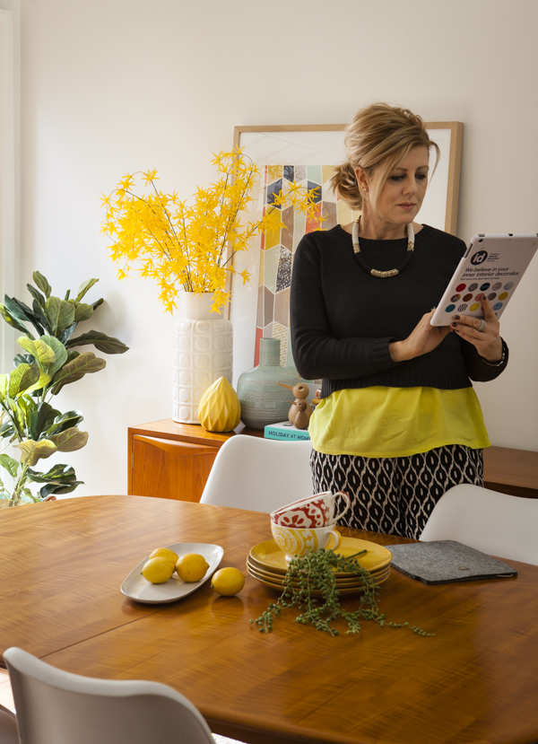
Diane Birol from Freedom’s ID Service. Featuring Fiddle Leaf Fig, Clementine print, white Charade vessel, Allegra vessel, Winston gem statue in Honeydew, Sorrento platter in Nougat, Jett dinner plates in Canary, Impressions mini bowls in Indie and string of pearls foliage, with white Brandon dining chairs, all from Freedom. Vintage Parker dining table and Fler sideboard, my own. Photography by Lucas Boyd for Wee Birdy. Styling by Diane Birol & Juliana Verissimo/Freedom ID Service. Production by Rebecca Lowrey Boyd/Wee Birdy.
I’ve always been nervous about consulting a decorator, as I have my own distinctive sense of style, and I’ve also done a bit of styling work over the years. But since we moved into the Treehouse, I’ve wanted to get another pair of (trained) eyes to look at the space.
It’s actually something super-stylist Megan Morton recommends, too. I attended her Science of Styling Masterclass earlier this year, and she said that even the best stylists need help – and a second pair of eyes – when decorating and renovating their own home. It’s really hard to get an objective distance on styling your own home, especially when you’re used to dealing with interiors and design. It’s easy to feel overwhelmed and confused by too many options.
I already had a good idea of some of my favourite pieces from the new Freedom spring/summer 2014 collection, but it was great to get Diane’s opinion, and she also carefully examined our dining room space and offered some invaluable (and rather genius) advice on how we could improve it – from both an aesthetic and functional point of view.
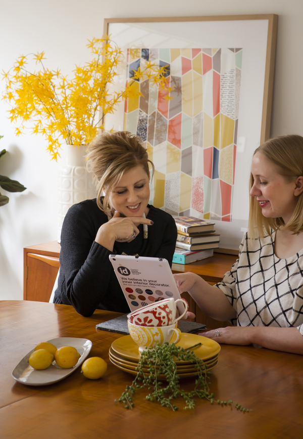
Me (right) and Diane talking dining room options. Featuring Fiddle Leaf Fig, Clementine print, white Charade vessel, Sorrento platter in Nougat, Jett dinner plates in Canary, Impressions mini bowls in Indie and string of pearls foliage, with white Brandon dining chairs, all from Freedom. Vintage Parker dining table and Fler sideboard, my own. Photography by Lucas Boyd for Wee Birdy. Styling by Diane Birol & Juliana Verissimo/Freedom ID Service. Production by Rebecca Lowrey Boyd/Wee Birdy.
I really wanted to move my beloved vintage Fler sideboard to the dining room, as it would work well with the teak Parker table. However, one wall was to short for the sideboard, another had a huge air-conditioning vent, and the third wall had some unattractive built-in cupboards. I’ve been obsessed with having enough storage, but if anything, we have an excess amount of storage options in the Treehouse. When Diane recommended that we gyprock over the cupboards to allow room for our sideboard and give our dining room wall clean lines, I summoned the bravery to go ahead and do it.
We also looked at different pendant lamp options to hang over the dining table. What you can’t see in the ‘after’ image above is my husband’s hand holding the top of the lamp! We currently have the original white glass elliptical pendant lights above the dining table, but they hang quite high and I’d love something that made a statement. I’ve been shopping around for pendant lamps and it was great to see how Freedom’s new Creel pendant lights adds texture and softness to the space.
Diane agreed that the new ’60s-inspired Brandon oak dining chairs would work beautifully with my Parker dining table, and the solid oak legs would add that touch of Scandi I love so much, while avoiding that showroom matchy-matchy look.
The chairs also come in a brilliant turquoise that really pops, so we played around with them in the shoot. You can see the turquoise chair in the photo below with my three-year-old playing on the rug. Oh and functionality? They’re sturdy and stable. And the cushioned polypropylene base makes them super-comfortable. You could yack for hours over a cheese platter with a cheeky sticky in these chairs.
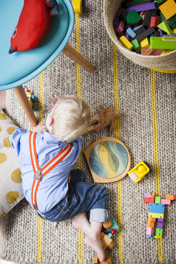
Mr 3 making himself at home in our new dining room. Featuring Boyd rug in yellow, turquoise Brandon dining chair, Neisha spot cushion in yellow, and Bright Band large two handle basket in yellow, all from Freedom. Photography by Lucas Boyd for Wee Birdy. Styling by Diane Birol & Juliana Verissimo/Freedom ID Service, Production by Rebecca Lowrey Boyd/Wee Birdy.
Finally, Diane recommended we ‘ground’ our dining table with a rug – and the lovely new Boyd rug was a no-brainer. It’s low-pile (so it’s easy to clean and great with kids), and the natural fibres add texture and depth to the room, while the yellow stripe adds a pop of colour.
I already have a number of Freedom’s bright band baskets in various sizes and colours, which I use as storage for Mr 3’s toys throughout the house. I like the idea of having toys and play options in every room of the house, without it becoming too obtrusive, or untidy. After all, it’s his home as well, and I’m fond of the Montessori idea of kids having easy access to their own things and toys. He loves to rummage through the baskets and find toys he hasn’t played with in a while, and when play time is over, it’s easy for him to pick up his toys and throw them back in. I’ve now placed a basket of toys under the stairs, and there’s another basket sitting next to the sideboard.
So here it is: my dining room makeover.
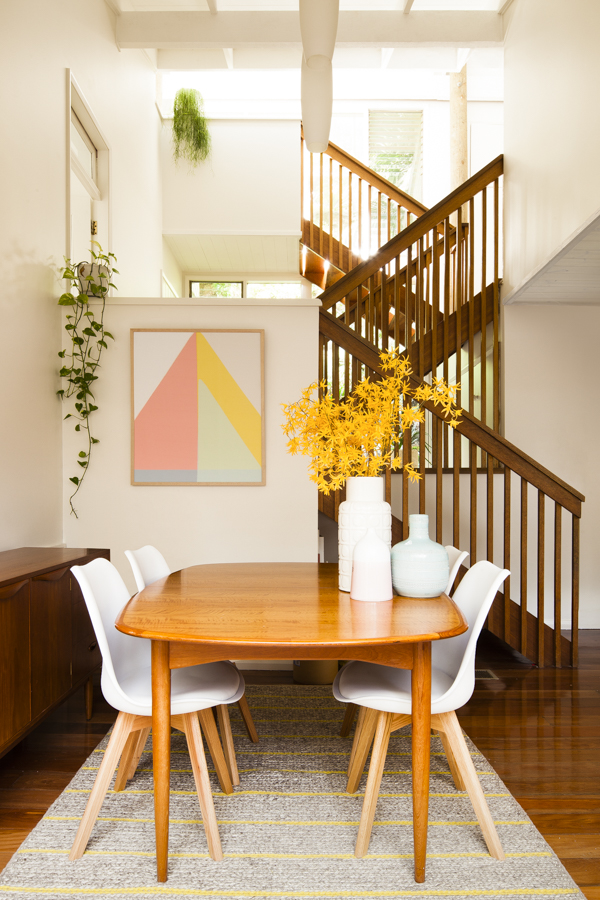
The full picture: my dining room makeover with Freedom, featuring white Brandon dining chairs, Boyd rug, white Charade vessel, Allegra vessel, pink Casey vessel, and Geo Triangle print in pink, all from Freedom. My own vintage Parker dining table, Fler sideboard and plants. Photography by Lucas Boyd for Wee Birdy. Styling by Diane Birol & Juliana Verissimo/Freedom ID Service, Production by Rebecca Lowrey Boyd/Wee Birdy.
What do you think? It’s made an amazing difference, right? And do you think I should go for the Creel pendant lamp?


